Commercial painting is far more than just maintenance; it’s a strategic business instrument. The colors chosen for walls, floors, and components directly shape worker attitude, customer actions, and the perceived standing of your brand. This is the application of color psychology in business settings.
For facility managers and proprietors, selecting paint colors often feels weird. The issue is that a poor color preference can accidentally diminish focus, reduce activity, or clash with brand identity.
As commercial painting contractors with deep know-how, we move past simple covering. We connect with customers to supply color choice support, making certain the finished product helps your specific business targets, whether that’s raising efficiency or creating a restful setting.
Let’s examine how specific colors can adjust the role of your area and how our support confirms the outcomes you want.
The Business Worth of Thoughtful Color
Why should a facility manager care about the precise shade of paint? Painting represents a considered spend with significant returns.
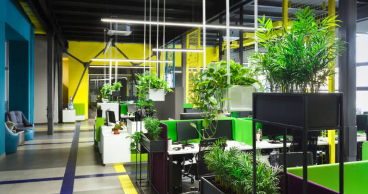
Improving Productivity and Focus
Certain colors, like blues and soft greens, have been shown to better concentration and lessen eye strain in office settings. This straightaway affects worker output, which is a major contributor to your operating efficiency.
Affecting Customer Spending (Retail & Hospitality)
Color influences buying choices. Warm colors (red, orange) create quickness and excitement, which can spur unplanned purchases in retail locations. Cool colors (blue, green), conversely, suggest standards and reliance, positioning them well for financial or consulting areas.
Strengthening Brand Identity
Color is a silent communication device. Employing brand colors accurately across a large establishment, from a principal office building to a supply center, confirms recognition and professionalism right away.
Color Choices by Purpose (A Hands-on Look)
Colors should be picked based on the desired impact on users and customers.
For Concentration & Peace (Offices, Healthcare)
- Suggested Color Hint: Use soft blues, muted greens, and mild neutral shades (grays/beiges).
- What the Color Accomplishes: These shades aid a feeling of steadiness and concentrated thought, lessening worry.
For Activity & Motion (Manufacturing, Gyms)
- Suggested Color Hint: Use highlights of orange, bright yellow, and warm reds (used sparsely).
- What the Color Accomplishes: These colors quicken zeal and physical pace, appropriate for active locations where movement is necessary.
For Reliance & Security (Industrial, Corporate)
- Suggested Color Hint: Use deep greens, dark blues, and uniform whites or dark grays.
- What the Color Accomplishes: Blue aligns with dependability. Clean whites and grays signal hygiene and capability, crucial for industrial painting services and warehouse painting.
Color Plans in Different Commercial Settings
How the color plan changes based on property type:
Retail & Restaurants
To spur unplanned purchases, use warm colors (reds/yellows) near cash handling or sales displays. For areas where customers sit and relax, use cooler, comforting colors in eating or common areas.
Manufacturing & Logistics (Warehouses)
In warehouses, paint is utilized practically. Highly reflective whites and light grays are best for ceilings and walls to increase light and reduce energy use. Traffic coating and safety lines use highly visible colors (yellow, red) for regulation conformance and security. Does ceiling color matter? Yes, light colors maximize light reflection, improving worker security and visibility.
Education & Institutional Facilities
Use soft, focused colors in classrooms and offices to support learning. Use brighter, stimulating colors in common areas or gyms. Always avoid overly intense colors that cause lack of concentration.

Connecting with Southeast Painters for Color Success
The gap between color concepts and flawless completion is where a knowledgeable collaborator makes the greatest difference.
We help facility managers move past simple color squares, giving advice on plans that match the required purpose of the space and the specific lighting situations.
Our standing as professional commercial painting companies means we use low-VOC (Volatile Organic Compound) paints that minimize scent and inactivity, allowing you to return to business fast. We furnish seamless coating for walls, resinous flooring, and structural elements, confirming color sameness throughout the property.
The Right Materials for the Job
For industrial areas, we warrant that colors are put down using special, enduring coatings (like epoxies or urethanes) that hold their intended shade against rubbing and chemicals, keeping both purpose and appearance.
The Return on Investment of Color
Selecting the correct color is a small judgment that leads to large results, from improved worker morale to greater consumer participation. Don’t let your paint judgment be random; make it calculated.
Ready to use color thoughtfully in your property? Contact Southeast Painters today for a color consultation and a free price quote on your commercial painting services project.
Call us at 423.266.6615 or visit our website to connect with expert industrial painting contractors.
